Fall Color Palette Ideas for Handmade Decor
Four fall palettes for handmade decor, from classic harvest to moody plum, with a simple proportion guideline and tips for matching colors to the room you already have.
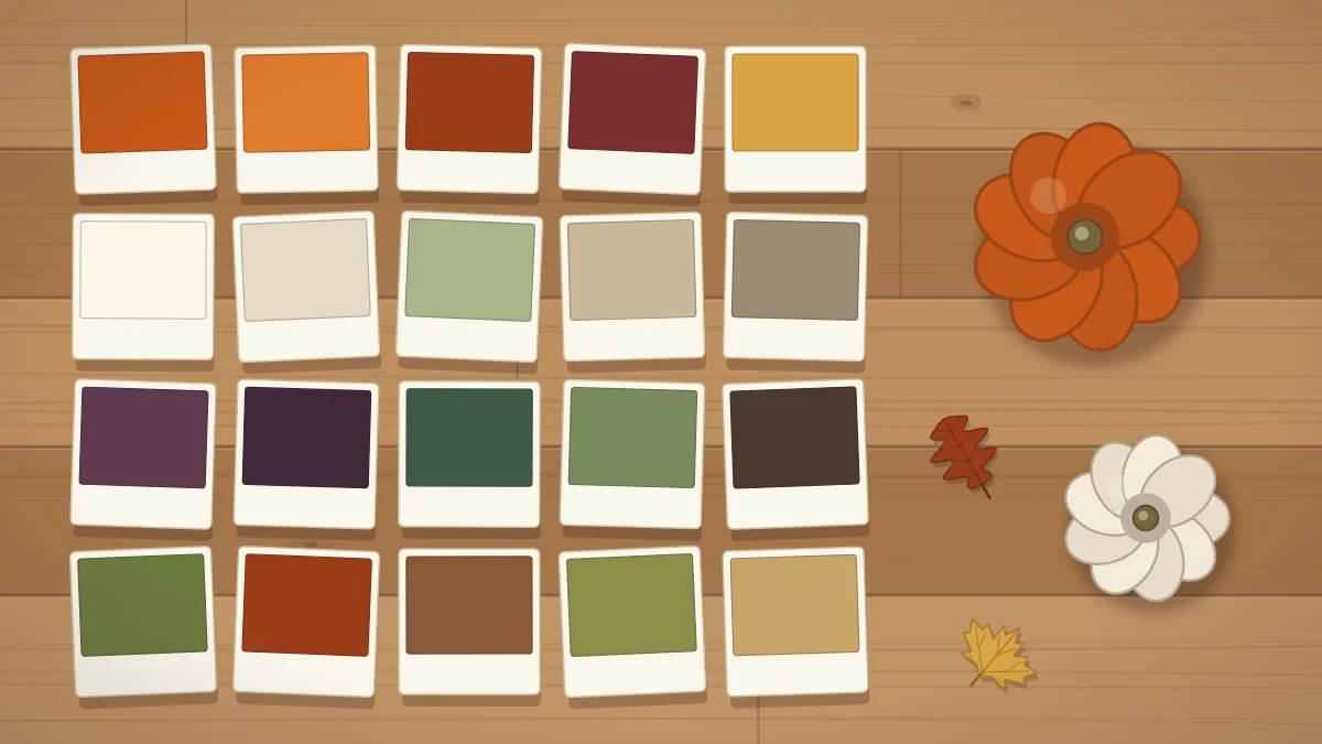
A fall color palette is simply a short list of colors you agree to stick with. Choose three to five, repeat them from the front door to the dining table, and even very simple handmade pieces start to look planned.
Below are four palettes that work well for handmade decor, a simple way to balance them, and how to match them to the furniture and walls you already have.
Why three to five colors is enough
Fall offers a lot of color at once: orange pumpkins, red leaves, golden wheat, green gourds, brown pinecones. Use all of it together and a room can feel busy rather than cozy.
A limited palette solves that. Three colors is the minimum for interest, five is about the most a room can hold before the eye stops reading them as a group. Natural textures such as wood, twine, burlap and wicker count as free neutrals, so they do not use up one of your slots.
Four fall palettes to borrow
Classic harvest
Pumpkin orange, mustard yellow, deep red and brown. This is the palette of a farm stand, warm and cheerful, and the easiest to shop for because real pumpkins, leaves and wheat already come in these shades.
Soft neutral
Cream, tan, sage green and white pumpkins. It is calm and light, and it blends into pale rooms instead of competing with them. Texture carries the interest here, so lean on burlap, knit fabric and dried grasses.
Moody
Plum, burgundy, forest green and gold. These deep tones feel rich in the evening and look striking against dark wood or white walls. A little gold goes a long way, so save it for small touches such as painted pumpkin stems or ribbon.
Woodland
Olive, rust and bark brown. It is the quietest of the four and the most natural, built almost entirely from things you could find on a walk: pinecones, acorns, moss-colored felt and dried leaves.
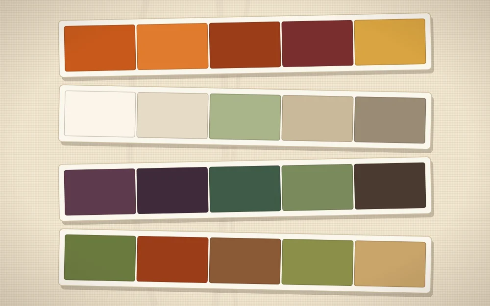
| Palette | Colors | Mood | Suits |
|---|---|---|---|
| Classic harvest | Orange, mustard, deep red, brown | Warm, cheerful | Porches, kitchens, family rooms |
| Soft neutral | Cream, tan, sage, white | Calm, airy | Pale rooms, small spaces, bedrooms |
| Moody | Plum, burgundy, forest green, gold | Rich, dramatic | Dining rooms, dark wood, evening tables |
| Woodland | Olive, rust, bark brown | Quiet, natural | Mantels, entry tables, rustic rooms |
The 60-30-10 proportion idea
Knowing your colors is half the job; the other half is deciding how much of each to use. A common decorating guideline splits a scheme into three unequal parts.
- About 60 percent, the main color: usually the calmest shade, used on the largest pieces.
- About 30 percent, the secondary color: noticeably different, used on medium pieces.
- About 10 percent, the accent: the boldest shade, used sparingly.
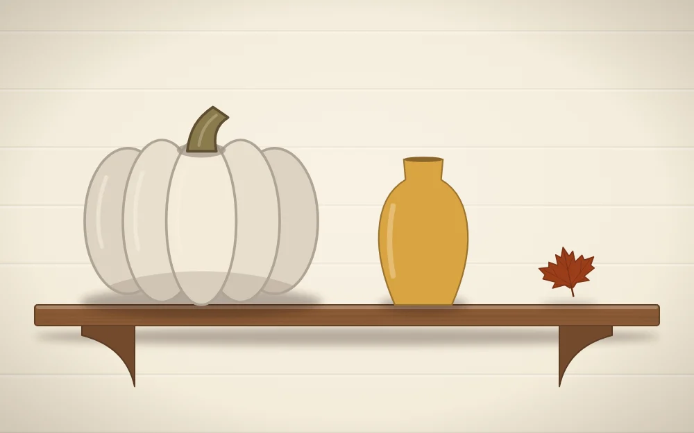
On a shelf, that might be a large cream pumpkin, a medium mustard vase and one small rust leaf. Nobody measures this, and you should not either. It is a reminder that equal amounts of every color tend to look flat, while unequal amounts look composed.
If you add a fourth or fifth color, tuck it into the secondary or accent share rather than giving it a share of its own.
Choosing one accent
The accent is the color you notice first, so pick just one and let it appear a few times across the room: a ribbon here, a painted stem there, a single napkin tie on each plate.
A reliable way to find an accent is to look across the color wheel from your main color. Sage walls and cream pumpkins wake up with a touch of rust. A mostly orange porch looks sharper with a little deep blue-green or plum.
Tip
Tape small paint or paper swatches of your chosen colors to an index card and keep it in your bag. It makes matching felt, ribbon and paint in a shop much easier than working from memory.
Matching a palette to the room you have
Your sofa, rug, walls and wood tones are already part of the palette, whether you chose them for fall or not. Start there.
- Name the two largest colors in the room, for example gray sofa and warm oak floor.
- Decide whether the room is mostly warm (beige, wood, brick) or mostly cool (gray, white, blue).
- Warm rooms take classic harvest and woodland easily. Cool rooms often look better with soft neutral or moody, where orange is reduced or replaced.
- Pick the palette that shares at least one color with something already in the room.
If your furniture is strongly colored, treat that color as your main share and choose only a secondary and an accent to go with it.
Keeping the palette across the house
Consistency is what makes separate projects feel like one scheme. You do not need the same items in every room, only the same colors in different proportions. The porch might be mostly orange with cream accents, while the dining table flips to mostly cream with orange accents.
Paint is the fastest way to pull stray pieces into line. A pumpkin in the wrong shade becomes the right one with two coats, and the guide to painted pumpkin ideas covers prep and patterns. At the table, cloth, napkins and centerpiece all carry color, so plan them together using these fall tablescape ideas.
Testing before you commit
Gather a sample of everything, such as a felt sheet, a ribbon end, a paint dab on paper and a real leaf, and set the group down in the room where it will live. Look at it in daylight and again under your evening lamps, because warm bulbs push every color toward yellow.
If one item jumps out, it is either your accent or it does not belong. Remove it and see whether you miss it. Once the group looks settled, choose a first project from this list of easy DIY fall decorations and make it in those colors.
Frequently asked questions
What colors go together for fall decor?
Warm shades such as pumpkin orange, mustard, rust and deep red pair naturally with brown, cream and muted greens like sage or olive. For a deeper look, plum, burgundy and forest green work well with small touches of gold. Choosing three to five of these and repeating them keeps a room cohesive.
Can I decorate for fall without using orange?
Yes. A soft neutral scheme of cream, tan, sage and white pumpkins feels seasonal through texture and natural materials rather than bright color. A moody scheme of plum, burgundy and forest green also reads clearly as fall. Wheat, pinecones and dried leaves supply warmth on their own.
How do I use the 60-30-10 idea in a small space?
Apply it to a single surface instead of the whole room. On one shelf or entry table, let the largest object carry your main color, a medium object carry the second, and one small detail carry the accent. It is a loose guideline for balance, not something to measure.